Affinity Diagram
An affinity diagram groups many ideas into natural themes. Learn how to run an affinity mapping session, see an example, and cluster ideas with your team.
What is an affinity diagram?
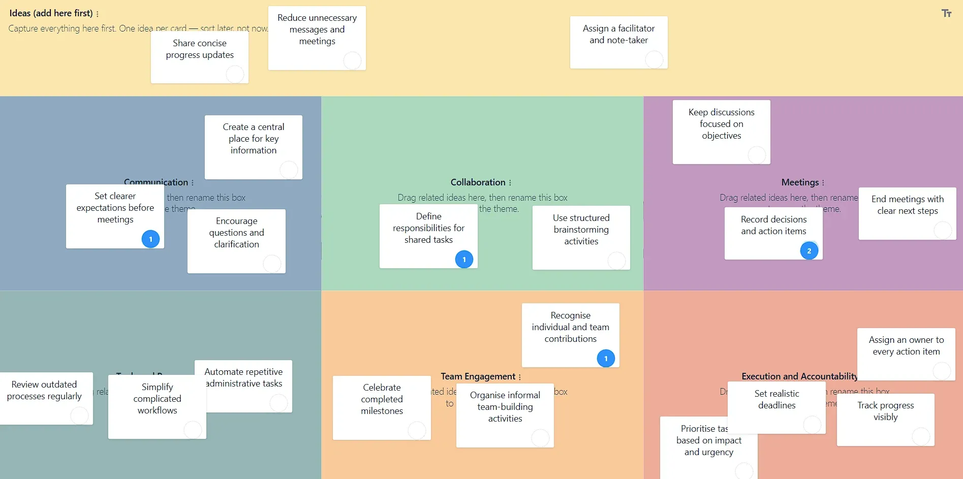
An affinity diagram is a method for organizing a large number of ideas, observations, or data points into groups based on their natural relationships. Instead of sorting notes into categories you decide in advance, you let the themes emerge from the notes themselves, so the structure reflects what the data is actually saying.
Also known as affinity mapping, affinity clustering, or the KJ method, it is one of the most reliable ways to make sense of the messy output of a brainstorm, a research study, or a retrospective. Dozens of scattered notes become a handful of clearly labelled themes the team can reason about and act on.
It is the qualitative end of the decision-making frameworks: use it to understand the problem, then a scored framework like a decision matrix to choose between the options it surfaces.
Key takeaways
- An affinity diagram clusters many individual ideas into natural themes.
- The categories emerge from the ideas rather than being defined up front.
- It is ideal for making sense of large volumes of qualitative input.
- The initial sort works best done silently and collaboratively to avoid bias.
- Add voting or scoring afterward to prioritize the themes that matter most.
Why use an affinity diagram?
After a good brainstorm you often have more ideas than you can hold in your head. An affinity diagram helps by:
- Turning a chaotic wall of notes into a small number of understandable themes.
- Letting patterns emerge naturally instead of forcing ideas into pre-decided buckets.
- Giving quiet contributors equal weight, since ideas are grouped, not debated one by one.
- Creating a shared understanding that makes the next decision (what to prioritize) far easier.
Who should use an affinity diagram?
Affinity diagrams are used across product, design, research, quality, and agile teams. UX researchers cluster interview findings, product teams organize feature requests, facilitators synthesize workshop output, and scrum teams group retrospective ideas into themes. Anyone facing a large, unsorted pile of qualitative input can use one.
How affinity mapping works
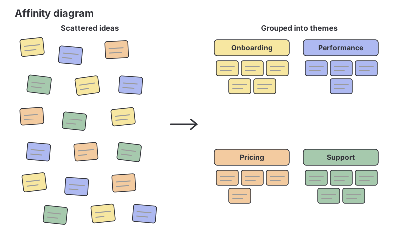
The process moves from scatter to structure:
- Generate notes: everyone writes ideas or observations on individual notes, one idea per note.
- Sort in silence: cluster related notes together without discussion, so the grouping follows genuine affinity rather than argument.
- Name the themes: once clusters settle, add a header note that captures the theme of each group.
- Refine: split, merge, or move clusters until the grouping feels right.
- Prioritize: vote or score the themes to decide where to focus.
Affinity diagram example
A product team runs eight customer interviews and ends up with roughly sixty notes about pain points. Spread out, it is noise. Clustered, four themes appear: onboarding is confusing, the mobile app is slow, pricing tiers are unclear, and support responses are too slow. Dot voting shows onboarding and pricing carry the most weight for the team.
In minutes, sixty scattered observations have become four named problems and a clear signal about which two to tackle first, a result no single note could have delivered on its own.
How to run an affinity diagram in GroupMap
GroupMap is built for exactly this flow. Everyone brainstorms notes at the same time, independently, so no one anchors on the first idea. Then the group drags related notes into clusters and labels each theme. Because contributions can be gathered privately first, the diagram reflects the whole team’s thinking, not just the loudest voices. Add dot voting to prioritize the themes, then convert the top clusters straight into action items, whether your team is in the room or spread across the world. If the wall of notes is large, AI grouping can make the first pass: it proposes named themes, and you accept, refine or dismiss each one before anything moves on the map.
Limitations of an affinity diagram
Grouping is an act of interpretation, so two teams can cluster the same notes differently, and a confident voice can quietly steer the themes. Doing the first sort silently and collaboratively helps keep it honest. And while an affinity diagram organizes ideas beautifully, it does not tell you which theme matters most, which is why prioritizing the clusters with voting or scoring is part of the method, not an optional extra.
Related templates
References
- Affinity diagram, American Society for Quality (ASQ)
- Affinity diagrams, Interaction Design Foundation
Turn scattered ideas into clear themes with GroupMap
GroupMap takes the friction out of affinity mapping. Everyone contributes at once, ideas are gathered before they are grouped, and the whole team shapes the clusters together in real time. The result is a shared, labelled picture of what the data is really saying, plus a prioritized shortlist of themes your team is ready to act on.
Frequently asked questions
What is an affinity diagram?
How do you create an affinity diagram?
What is the difference between an affinity diagram and affinity mapping?
When should you use an affinity diagram?
What are the limitations of an affinity diagram?
How to run it in GroupMap

Brainstorm
Everyone adds ideas, observations, or data points as individual notes: one idea per note, as many as they like.

Group
Cluster related notes together and name each emerging theme, letting the categories arise from the ideas rather than being imposed.

Vote
Use dot voting to prioritize which themes matter most so the group focuses its attention where it counts.

Results
Review the labelled clusters and their priorities, then agree the next actions for the themes that rose to the top.
Ready to get everyone on the same page?
Start a free GroupMap and turn your next discussion into clear, shared decisions.