T-chart
A T-chart is a two-column graphic organizer for comparing two sides: pros and cons, before and after, cause and effect. Build one live with your group.
What is a T-chart?
A T-chart is a two-column graphic organizer used to compare or contrast two sides of a topic. It takes its name from its shape: a horizontal line across the top holds the two column headings and a vertical line down the middle divides the page, together forming a letter T. Ideas are then listed in the two columns so the two sides can be weighed side by side.
Because it is so simple, the T-chart is one of the most versatile organizers there is. The two columns can hold pros and cons, advantages and disadvantages, before and after, facts and opinions, cause and effect, or any other pairing where seeing two sides next to each other helps you think.
Key takeaways
- A T-chart is a two-column organizer for comparing two sides of a topic.
- The name comes from its T shape: two headings on top, a dividing line down the middle.
- Common uses: pros and cons, advantages and disadvantages, before and after, facts and opinions, cause and effect.
- Its strength is speed and clarity — it gets a group weighing two sides fast.
- The real value is the conclusion you draw after both columns are full, not the list itself.
When to use a T-chart
A T-chart fits any question that has two clear sides. Some of the most common pairings:
| Left column | Right column | Use it to… |
|---|---|---|
| Pros | Cons | weigh a decision |
| Advantages | Disadvantages | compare two options |
| Before | After | show change over time |
| Facts | Opinions | build critical-reading skills |
| Cause | Effect | analyse why something happened |
| Problem | Solution | pair issues with fixes |
Why use a T-chart?
- It is fast and unintimidating. Two columns are easy for anyone to start filling in, which makes it a great warm-up or discussion opener.
- It structures a comparison. Forcing ideas into two columns keeps a debate balanced instead of one-sided.
- It supports decisions. Laying out both sides makes the trade-offs visible before a group commits.
- It builds thinking skills. In the classroom, sorting facts from opinions or causes from effects is a core critical-thinking exercise.
Who should use a T-chart?
Teachers use T-charts constantly, whether comparing characters, sorting facts and opinions, or mapping cause and effect. Teams and facilitators use them to weigh options, run quick pros-and-cons discussions, and structure before-and-after reviews. Because it needs no special knowledge to use, a T-chart is a reliable choice whenever you want a group to consider two sides of something together.
T-chart example
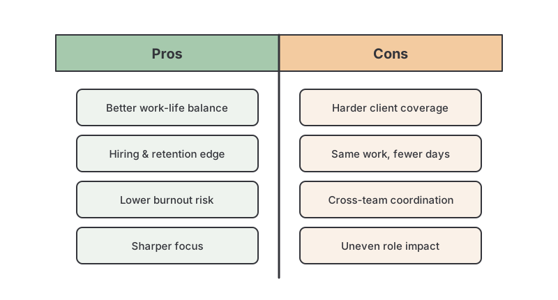
A team is deciding whether to adopt a four-day work week. Their pros-and-cons T-chart might look like this:
- Pros: better work-life balance; a hiring and retention advantage; potential productivity gains from focus; lower burnout.
- Cons: harder to cover client hours; risk of the same work compressed into fewer days; coordination across teams; uncertain impact on some roles.
Once both columns are full, the team dot-votes the points that matter most and uses the weighted picture, not a raw count of items, to decide. The chart makes the trade-off explicit and gives everyone a shared record of the reasoning.
How to run a T-chart in GroupMap
A T-chart on a whiteboard captures whoever speaks loudest. In GroupMap, everyone adds to both columns at once, so the comparison reflects the whole group.
- Set the question and label the two columns as the objective.
- Brainstorm both sides: everyone adds points under each column at the same time.
- Group similar points so each column is easy to scan.
- Vote to weight the points that matter most.
- Conclude and share: review the two sides, agree an outcome, and share the chart.
Limitations of a T-chart
- It only handles two sides; for three or more perspectives use a multi-column list or a PMI (plus, minus, interesting) chart.
- It shows the two sides but not their overlap; if what the two things share matters, a Venn diagram fits better.
- A long list in each column can imply a “count the items” decision; remember to weight and discuss, not just tally.
Related templates
- Pros and cons list: the classic two-column T-chart for weighing a decision.
- PMI (plus, minus, interesting): add a third “interesting” column for a more rounded view.
- Frayer model: a four-square organizer for understanding a single term.
- Empathy map: organize what a person says, thinks, does and feels.
References
- Implementing the text structure strategy in your classroom: Reading Rockets on using T-charts as a compare/contrast graphic organizer.
- Graphic organizer: overview of organizer types including the T-chart.
Weigh both sides together with GroupMap
A T-chart works best when both columns come from the whole group, not just the person at the board. GroupMap lets everyone add points to each side at once, cluster and weight them live, and reach a conclusion that reflects the room, with a shared record of both sides that is ready to share the moment the discussion ends.
Frequently asked questions
What is a T-chart?
What can you use a T-chart for?
What is the difference between a T-chart and a Venn diagram?
How do you make a T-chart?
Is a T-chart the same as a pros and cons list?
How to run it in GroupMap

Objective
Name the question and label the two columns (for example "Pros" and "Cons", or "Before" and "After") so the comparison is clear from the start.

Brainstorm
Ask everyone to add ideas under each column at the same time, so both sides of the comparison fill up with the group's thinking.

Group
Cluster similar or duplicate points within each column so the two sides are easy to read and compare at a glance.

Vote
Use dot voting to weight the points that matter most, so the strongest arguments on each side stand out.

Results
Review the two columns together, draw a conclusion, and share the T-chart with the group as a record of the discussion.
Ready to get everyone on the same page?
Start a free GroupMap and turn your next discussion into clear, shared decisions.